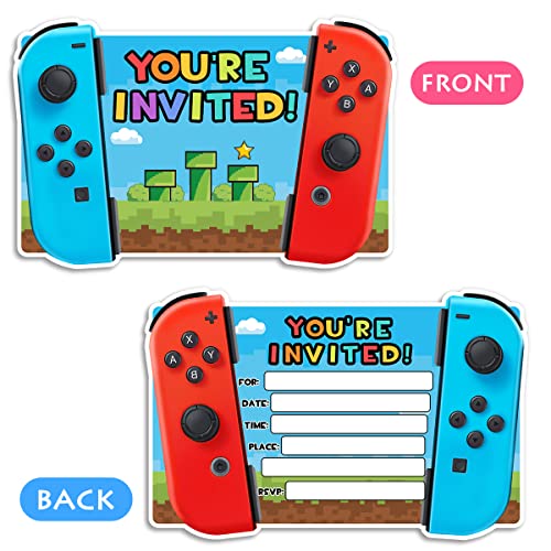
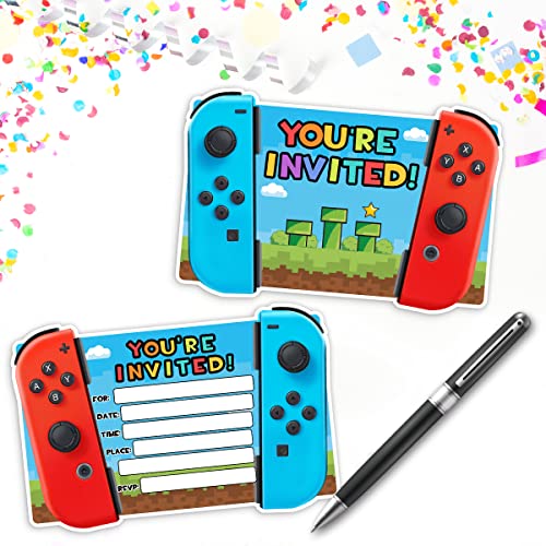
Prioritize Illustration Style and Theme Consistency
The defining feature of Simimi-style art is the specific illustrative hand. When browsing, do not simply look for 'cute' designs. Look for a cohesive artistic language. Some invitations may feature bold, thick outlines and vibrant, saturated colors that suggest a high-energy party, while others might use soft watercolors and delicate linework for a more sophisticated, dreamy atmosphere. Ensure the art style aligns with your venue and decor. If you are hosting an event in a rustic outdoor setting, look for organic, hand-drawn textures rather than overly digital or neon-heavy graphics. The art should act as a preview of the visual experience your guests will encounter once they walk through your doors.
Evaluate Paper Stock and Tactile Quality
Because art-centric invitations are meant to be admired as miniature pieces of art, the medium is just as important as the message. A beautiful illustration can be undermined by thin, flimsy paper that feels cheap or translucent. For high-quality art invitations, look for heavy cardstock—ideally anything above 300gsm (grams per square meter). A thicker stock provides a premium 'heft' that signals importance. Furthermore, consider the finish. A matte finish is often superior for illustrative art as it prevents glare and allows the colors to appear deep and velvety. If the design features gold foil accents or embossed textures, ensure these elements are integrated seamlessly into the print rather than feeling like an afterthought, as these tactile details elevate the invitation from a mere flyer to a keepsake.
Artistic designs can sometimes be visually 'busy,' which poses a risk to legibility. A common mistake is choosing an invitation where the whimsical illustrations crowd out the essential details. When selecting your design, check how the text is integrated. Is there a clear hierarchy? Can you easily distinguish the date, time, and location from the background patterns? High-quality invitations will offer a balance where the art frames the information rather than obscuring it. Additionally, look for options that allow for meaningful customization. Beyond just names and dates, the ability to adjust font styles to match the art's era or mood can make a significant difference in the final presentation.
Assess Envelope and Presentation Synergy
An invitation does not exist in a vacuum. It is part of a suite. A common pitfall is selecting a stunning piece of art but pairing it with a generic, plain white envelope. To truly lean into the artistic theme, look for invitations that come with coordinated envelopes—perhaps in a complementary color from the illustration or with a custom liner. The 'unboxing' experience of opening an envelope sets the stage for the event. If the budget allows, look for sets that include matching RSVP cards or detail inserts that maintain the same artistic integrity, ensuring a professional and curated look from the moment the mail arrives.