Understanding Print Mediums and Textures
The first decision you must make is the physical medium of the art. Fine art prints are not a monolith. The way ink interacts with the substrate changes the entire perception of the work. Canvas prints are the gold standard for classic, painterly aesthetics. Because the texture of the fabric mimics a traditional canvas, they soften the light and provide a three-dimensional feel that is ideal for landscapes and abstract oil-style works. On the other hand, high-definition paper prints offer a crispness that canvas cannot match. If you are selecting a piece with intricate geometric patterns, sharp architectural lines, or high-contrast photography, a premium matte or satin paper print will preserve those fine details without the distracting weave of a fabric surface.
Color Accuracy and Chromatic Depth
One of the most significant markers of a high-quality fine art print is its color gamut. Low-quality prints often suffer from 'muddy' shadows or washed-out highlights. When evaluating wall26 selections, look for descriptions that emphasize deep pigment saturation and color fidelity. A premium print should maintain the artist's original intent, ensuring that a deep navy blue remains rich and velvety rather than turning a dusty slate. Consider the lighting in your room before purchasing. A print intended for a dimly lit study may need higher contrast to pop, whereas a piece for a sun-drenched living room should be evaluated for how its colors react to natural UV exposure.
Scale, Proportion, and Compositional Impact
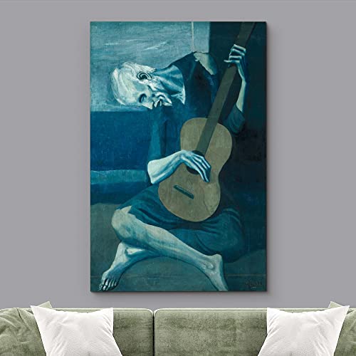
A common mistake in home decor is selecting art that is too small for the wall it inhabits, making the room feel cluttered or disjointed. When choosing your print, consider the 'Rule of Thirds' in relation to your furniture. A large-scale statement piece placed above a sofa creates a focal point that anchors the seating area. Conversely, if you are working with a smaller nook, a series of smaller, cohesive prints can create a rhythmic, curated look. Always measure your wall space and visualize the print's dimensions relative to your existing decor. A single, oversized fine art print often carries more 'prestige' and visual weight than several smaller, disconnected pieces.
Framing and Finishing Touches
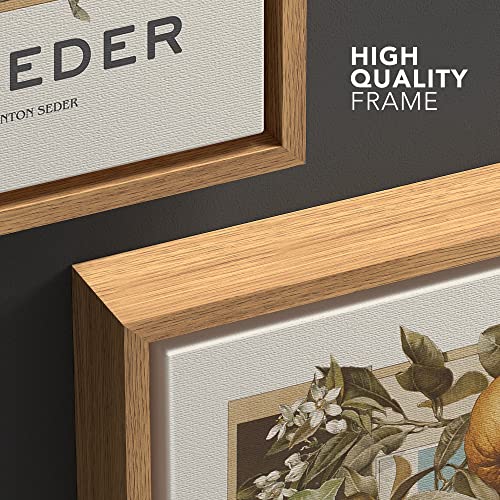
The frame is the window through which you view the art. A print is only as good as its presentation. For a modern, contemporary look, consider a floating frame for canvas pieces, which gives the illusion that the art is hovering within the wood. For paper prints, a wide mat board is essential. It provides 'breathing room' for the image and prevents the art from feeling cramped against the frame. The color of the frame should either complement the palette of the print or provide a deliberate, sophisticated contrast. A sleek black frame works universally for modern abstracts, while natural wood tones can add warmth to botanical or classical subjects.
Longevity and Material Integrity
Finally, consider the longevity of your investment. Fine art should not fade within a year. Look for prints that utilize archival-quality inks and UV-resistant coatings. This ensures that the vibrancy you see on day one remains consistent for years to come. High-quality mounting and sturdy backing are also non-negotiable to prevent warping over time, especially in environments with fluctuating humidity.